Field Types
Presspoint has a number of types of fields, some of which are highly particular to Presspoint. We’ve plans to continue to add different types of fields so, if you are not sure if the fields below meet your needs or, how you can best use a field, don’t hesitate to send us a support inquiry.
Address Group
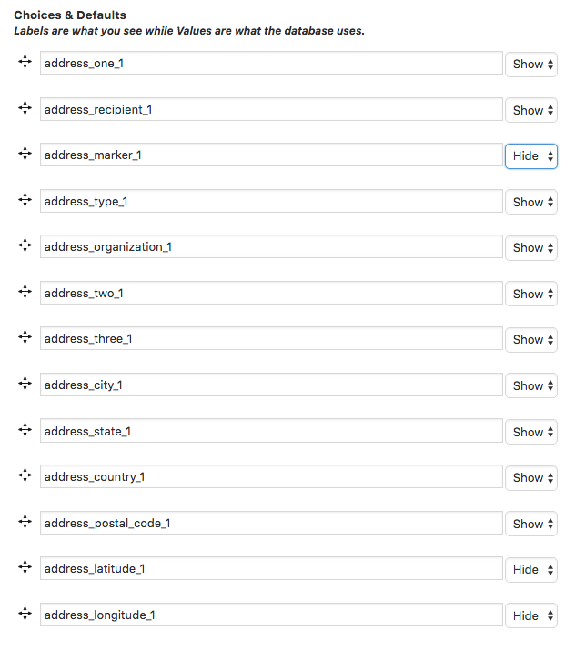
Address Groups are a preset group of related fields for capturing and displaying address information. You can have as many address fields as you like and if you have turned geocoding on, they will automatically collect latitude and longitude coordinates for mapping that address. Address groups have a special set of choices – you set which fields you want to display for the grouping by default and if you need to hide an individual field down the line, you can edit that individual field’s settings just like you would any other field.
Avatar
An Avatar is the current profile image for a given user. Adding an avatar field is only allowed for public-facing profiles and contains options to specify the size of the image and how it should be presented: as a square, a circle or a background square image (default).
Block (1, 2, 3, and 4 columns)
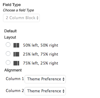
Blocks allow you to create sections in your forms and profiles that can be organized into 1, 2, 3 or 4 columns. Blocks are pretty versatile and you can take them pretty far to layout your fields and content for better usability or, as a styling framework to create things like landing pages.
Options include the ability to set how the columns are spaced in the layout. It is important that you make a selection to ensure that the display renders as you would expect. Additionally, you can choose how the contained fields align, the default being to match the current theme.
Checkbox (Single)
Single checkboxes are for when you want to collect a simple “yes”or “no” about something. Generally, these are the type of fields used in confirming Terms & Conditions so, the field has choices that you can set to link and display additional information (eg. the actual terms and conditions).
Checkboxes (Taxonomies/Multi-select List)
If you want to store multiple choices on a single field (eg. Favorite Places) then Taxonomies allow you to do that. We refer to them as “Taxonomies” because they are, in fact, managed by WordPress using the Taxonomy API. What this means, in simple terms, is that the same way that you categorize your blog posts can be the same way that you categorize your contacts. In fact, you can use the same taxonomies (eg. Categories) for your contacts as you already use on your blog posts.
A few things to note:
- Taxonomy database keys are automatically created for you and should not be changed.
- To add a new choice for a contact, you will first have to create and save the taxonomy, which will actually close the field preferences. This is expected though, admittedly, not preferred. Once you re-open the taxonomy by clicking on it on your form you can add a new “term” by entering the text in the “New Term” field and clicking the “+” button.
- You can actually manage other aspects of the taxonomy using the “manage” link. Here you can delete terms, edit terms and even extend taxonomies in the same way that you would for any other WordPress taxonomies.
- Values for taxonomies are stored as serialized data in the user metadata however, they are still able to be searched and exported as you would expect.
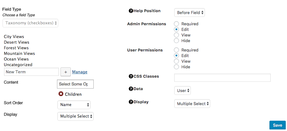
Additional Options:
- Content allows you to associate a taxonomy you create with your WordPress content if you so desire. This is an advanced topic and the use cases vary widely based on the application and purpose.
- Children refer to whether a taxonomy can have nested terms (eg. Parent > Child or Computer > Apple)
- Sort Order is currently limited to the Name or Order in which it was created.
- Display allows you to show the field as a series of checkboxes or as a type-as-you-go select field that allows for multiple selections. Additionally, you can choose the display on a form-by-form basis using the form settings on the right-hand side.
- Data refers to what type of object the taxonomy should write to. This is particularly useful when you want to use one taxonomy on both a profile and to describe content.
Date
The date field allows you to pick a date from a calendar and save the value. Currently, the value saved (and expected) is in the format: YYY-MM-DD (eg. 2016-12-25). You can manually enter a date if you choose but, again for now, please observe the expected format. Also, by default, year ranges are set to 5 years on either side of the present year. You can easily expand these ranges to be whatever values you like in the General “Setup” section on your Presspoint Settings page.
File Upload
If you would like the end-user to upload files, this is the field you will want to use. By default, the field will allow one or more files to be uploaded and the end-user does not need to be logged in prior to uploading. Once the end-user is identified as a contact the files are transferred to their personal file repository in the system and they are marked as the “owner.”
One important note: File uploads are always handled as a “General Field,” meaning that they are located on the right-hand side of a form and cannot be added as a field to a profile at this time. The files upload will be “owned” by the contact submitting the form, however, the files will also be a “child” element of the form that is submitted so that the association will persist so long as the form submission remains on the contact’s account
HTML
The HTML field allows you as the administrator to write or paste your own HTML into the “Default” area and have it display where you have placed the field. Primarily used for styling forms or presenting specific elements like embedded audio and video, the field is not meant to execute javascript or PHP code. If you are looking for more control of explicitly placed functionality, please review the Plugin field option below.
Link
A link field allows the user to supply both a label and a link, to be combined when viewed into a cohesive link. A good example use case is being used for social media links. Administrators can optionally supply the label while only presenting the link field for the user to fill out.
Multi-Text
Multi-text is special Presspoint field that is resonant of a “repeater” field where options can be manually added dynamically. However, Multi-text is a specific use containing one text field and one select list with pre-set values. If you are at all familiar with smartphone address books, then you are likely familiar with this use case where you can add multiple physical addresses, email addresses or telephone numbers using a value/select-list pairing.
Number
Number is a simple field that allows you to store a numeric value. A good example of this is “ID.”
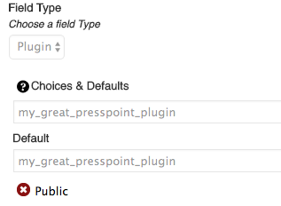
Plugin
A Plugin field is much like a plugin for WordPress – the difference being that Plugin fields are meant to run within the context of a Form or a Profile. To use a Plugin field, you must first create a callback function. In the example below we have created a function called my_great_presspoint_plugin which matches the callback we have pasted into both the choices and defaults options. When the field appears, the specified function will be called and executed.
Plugins are passed five (5) arguments and can be either a Profile or General field. Depending on the type of field the arguments passed will vary slightly:
- $fdata = The object property (varies based on type of field). Profile = WP User Object while General = an array containing; the field id, the field name, the field CSS and the WP Post ID.
- $fmeta = The metadata surrounding the field (eg. the database key, the field type, etc.)
- $fvalue = The value of the field if a value is stored
- $ftype = The type of object (varies based on type of field). Profile = ‘user’ while General = ‘post’
- $faction = The type of action (eg. edit, view or search )
Radio Buttons
Radio buttons work much like select lists (above) but the main difference is in the presentation where all of the choices are presented at once.
Section
Sections are used when creating a form with multiple pages. If you’re looking to break your form into pages with “next” and “previous” button, you can drag fields and groups of fields into sections which will automatically generate a navigation structure when the form is displayed.
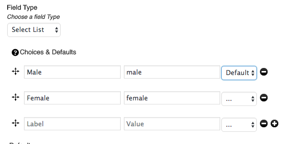
Select List
A select list presents a series of options of which one can be selected. Choices for these fields are presented as a Label > Value pairing where the Label is what you see and the Value is what is stored in the database. This is generally a good practice that Presspoint strongly encourages so as to preserve the integrity of your data.
You can drag-drop the choices to re-order your lists and you can set defaults for the select list using the select list included alongside each pairing. 🙂
Signature
If you would like to capture signatures online – either using a desktop or mobile device – you can do so using the signature field. It’s pretty neat.
Submit Button
Every form comes with a submit button by default – but sometimes you need to be able to place the button in a specific place. Creating a submit button allows you to do just that.
Text
Text is a simple field that allows you to store a single line of text. A good example of this is “First Name.”
Textarea
Textareas are for larger blocks of text that can have paragraph breaks and other data stored within it. A good example of this is “Biography.”
Username
A Username field displays the full name of a contact. Full names for organizations are the value of the Organization Name field. For individuals, the values of First Name and Last Name are concatenated.
Options include the ability to link to their profile or their content if you choose, however, when used in a Profile Card setting the Card link options override the Username field settings. Additionally, you can choose what type of HTML element the name should be displayed as.